Cox Planning Solutions
Cox Planning Solutions needed a brand identity created from scratch for their environmental planning business. I defined the core elements of the brand identity, which included the logo, color palette, typography, photography direction, brand voice and visual style. After developing all of the brand elements, I art directed the website.
Brand Board

Brand Style Guide
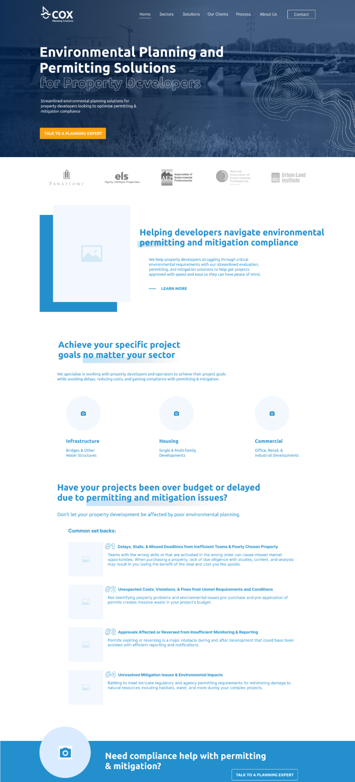
Homepage Wireframe
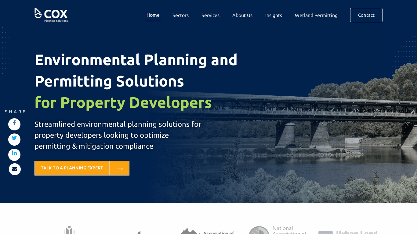
Final Homepage Design